Data Visualization in UX:
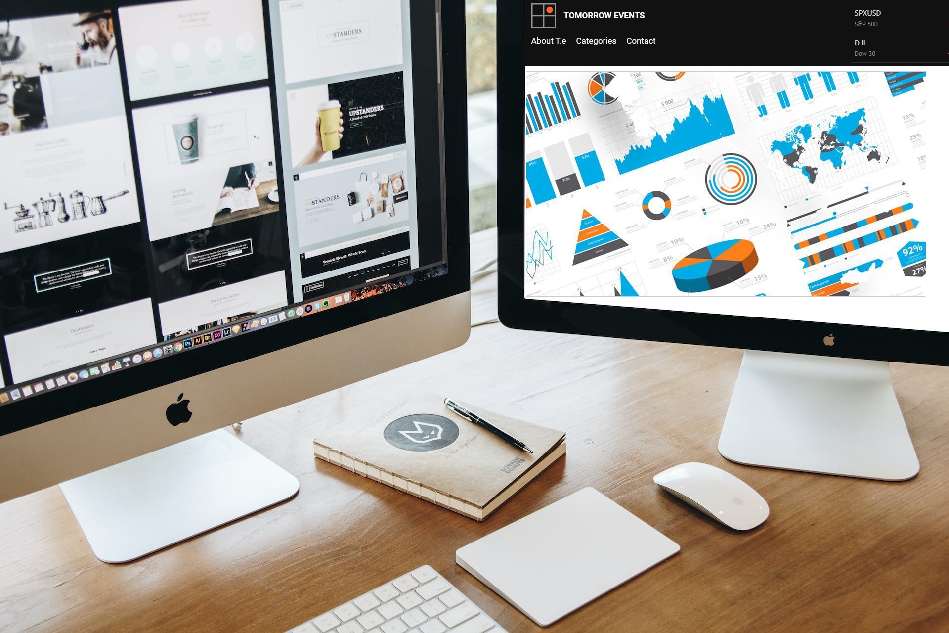
In the realm of user experience (UX), data visualization has emerged as a powerful tool, transforming raw information into meaningful insights. It goes beyond the mere presentation of data; it’s an art that tells a story, enhances transparency, and builds a stronger connection between users and products. As we delve into the intricacies of data visualization, it becomes evident that this practice is no longer confined to analysts and statisticians but has become an integral part of our everyday digital interactions.
The Evolution of Data Visualization: From Generic to Personalized
In the words of a renowned UX designer, “Understanding and analyzing certain types of data is a process that’s always been left to professionals.” However, the landscape is evolving rapidly. The surge in data-centric applications has shifted the responsibility of interpreting data from specialists to end-users. This democratization of data has not only empowered users but has also fundamentally changed the way we engage with various applications.
Consider the evolution of screen time tracking on our devices. It’s not just about generic bar graphs or pie charts anymore; it’s about providing users with a clear, visually appealing representation of their digital habits. This level of transparency not only fosters accountability but also encourages responsible usage. Lumen, an app dedicated to tracking and visualizing metabolism and energy levels, exemplifies this shift by offering users personalized and detailed insights into their daily activities.
However, it’s not just about raw data; it’s about making that data relatable and engaging for the user. Santo points out that data used to be displayed generically through charts and graphs, but now it needs to speak to the user. A stellar example is Spotify’s Only You feature, an in-app experience that employs a vibrant and trendy visual language to curate personalized music suggestions. This not only enhances user engagement but also makes the entire experience enjoyable.
The Rise of User-Centric Data Visualization Tools
As the demand for data visualization grows, brands are on the lookout for tools that can seamlessly integrate into their products, improving interaction and, in turn, enhancing users’ lives. The emphasis is shifting from mere functionality to aesthetics, with a growing recognition that the visual appeal of data is just as crucial as its accuracy.
In the quest for user-centric design, data visualization is becoming a key differentiator. Users no longer settle for static, generic representations of data. Instead, they seek dynamic and personalized visualizations that resonate with their preferences and lifestyles. Brands that recognize this shift are investing in creating visually appealing and engaging data experiences for their users.
The Impact on User Trust and Engagement
Trust is a critical element in the user-product relationship. Data visualization plays a pivotal role in building and maintaining this trust. When users can easily understand and interpret data presented to them, it fosters a sense of transparency and reliability. This is particularly crucial in applications where users make decisions based on the information provided.
Take financial apps, for instance. Users need to have a clear understanding of their spending patterns, investments, and financial health. Through intuitive data visualizations, these apps can empower users to make informed decisions, ultimately strengthening the trust users place in the platform.
Moreover, data visualization contributes to increased user engagement. Interactive and visually appealing representations of data captivate users’ attention and encourage them to explore further. This engagement is not just about presenting numbers; it’s about creating an experience that users find enjoyable and, in some cases, even shareable.
Looking Ahead: Future Trends in Data Visualization
As we move forward, the landscape of data visualization in UX is poised for further innovation. Trends suggest that more apps and platforms will focus on crafting fun and personal ways to present data, moving beyond traditional charts and graphs. The future lies in creating experiences that not only inform but also entertain users.
In recent times, data visualization has transcended its role as a technical aspect of UX and has become an essential element in creating memorable and impactful user experiences. Brands that understand the significance of user-centric, visually appealing data representations will undoubtedly stand out in the competitive digital landscape. As technology continues to evolve, so too will the art of data visualization, shaping the way we interact with and interpret the world of data that surrounds us.